One of my first projects at Asana was the Asana Dashboards feature.
Reporting was a highly requested feature from users, and user research indicated that users would benefit from a visual representation of the status of their projects. Team Leads wanted to be able to quickly check that everything was on track.
Goals:
• Be able to scan project status at a glance
• Visualize progress at a glance
• Choose the most relevant projects
• Ease the communication between Team Leads and Project Leads
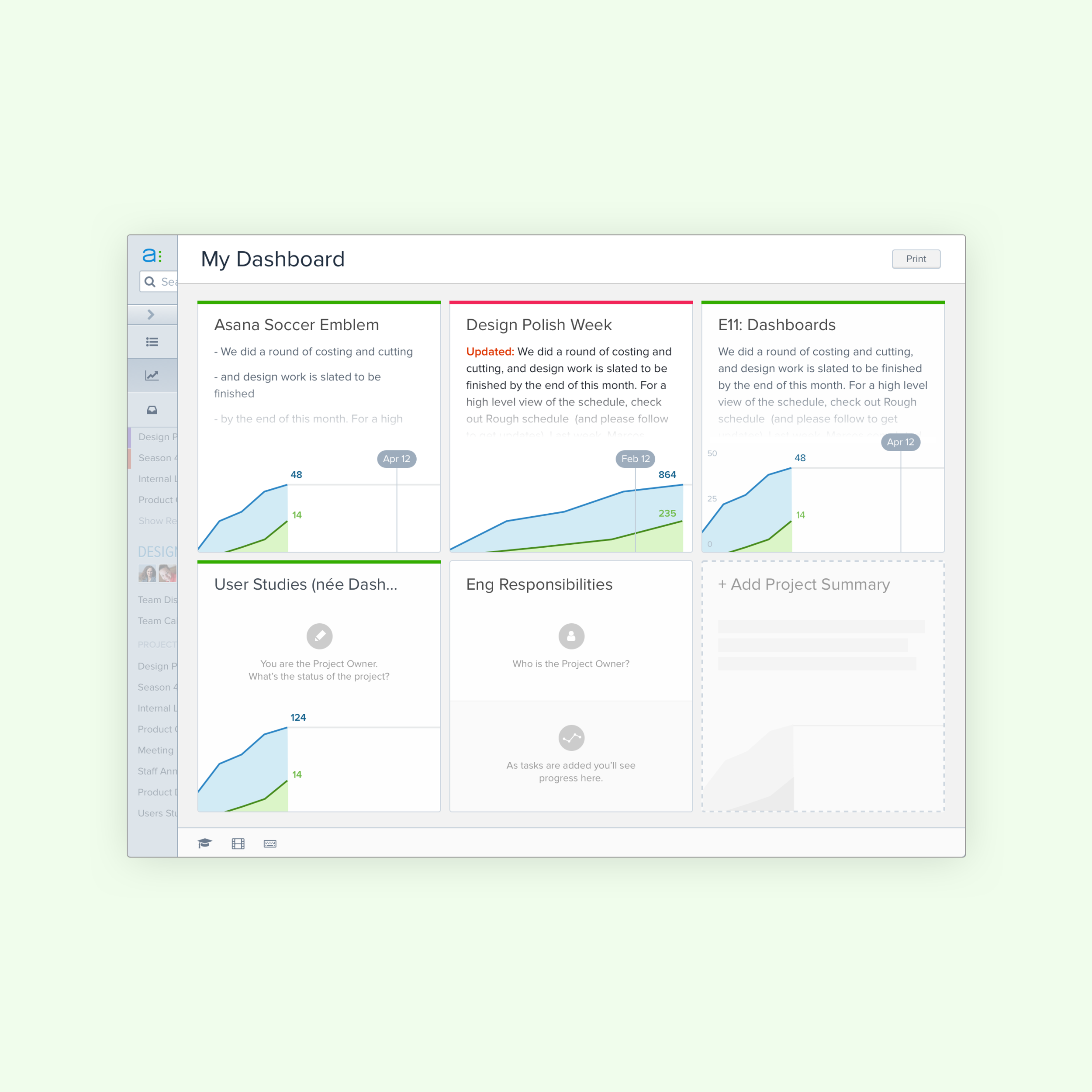
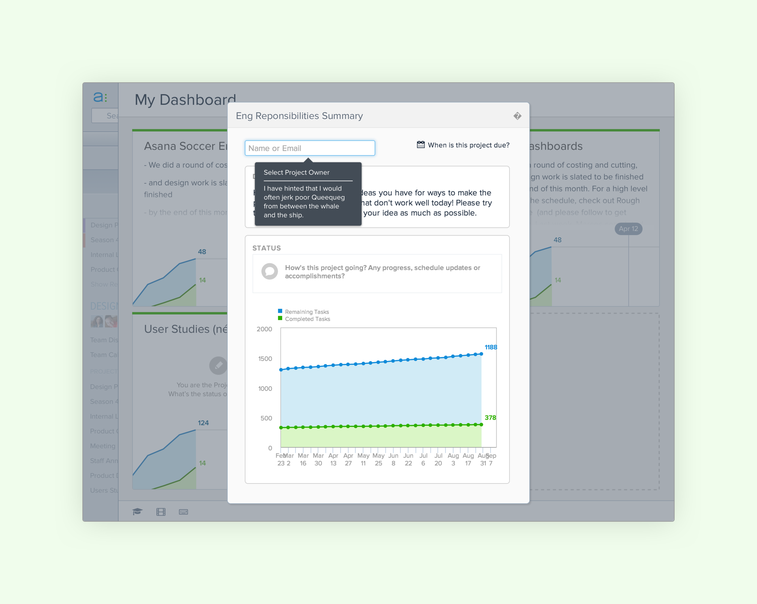
Asana Projects already had a Progress tab, which included a burn-up chart. In order to maximize consistency and ship quickly we used that chart as a starting point.
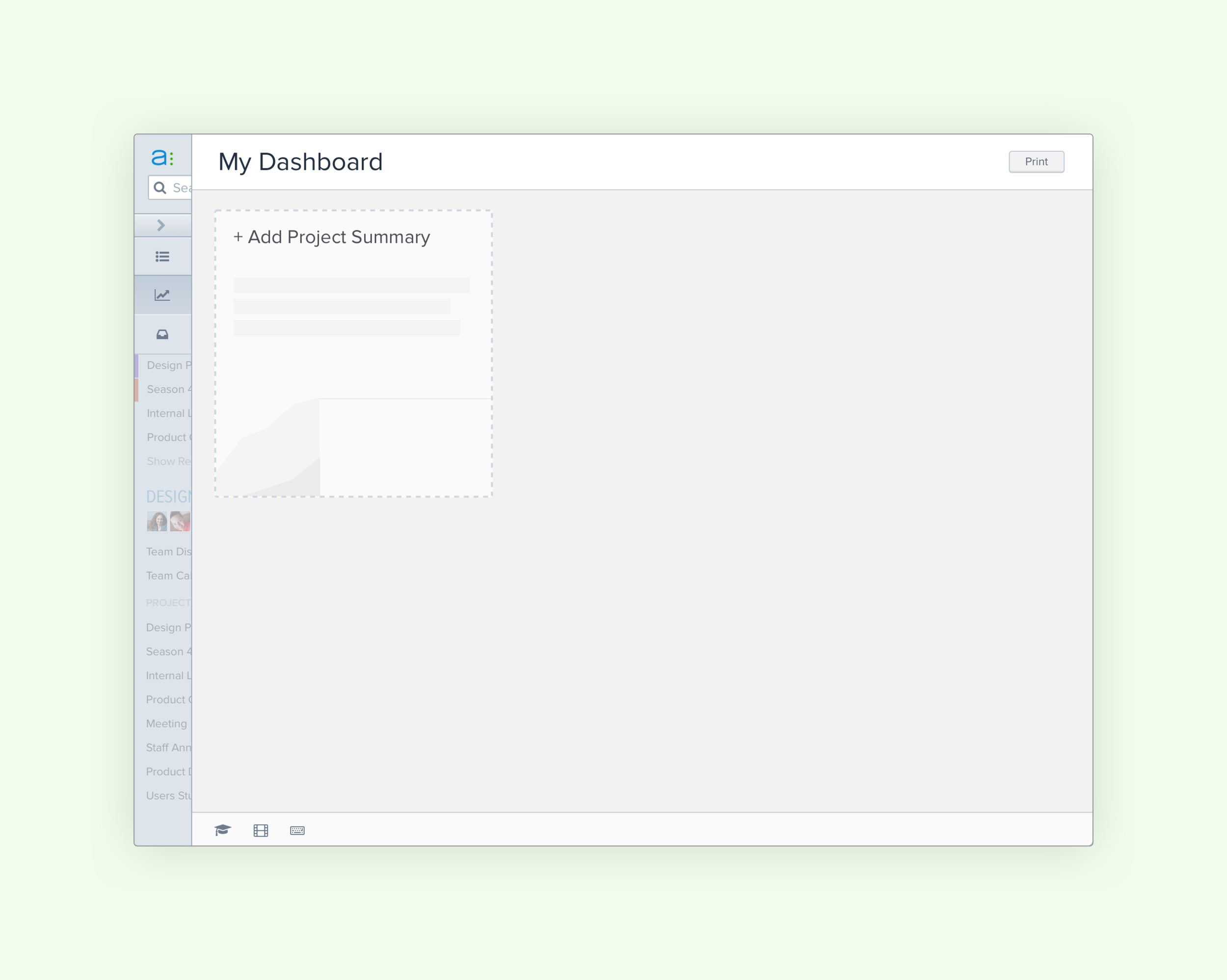
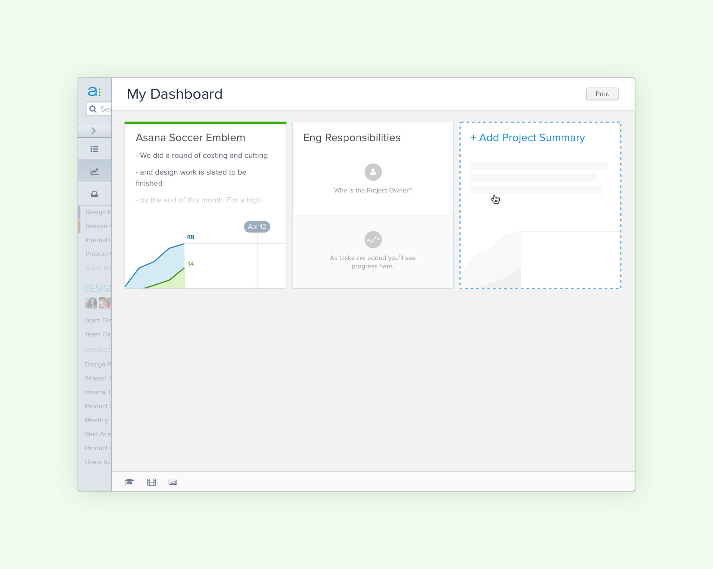
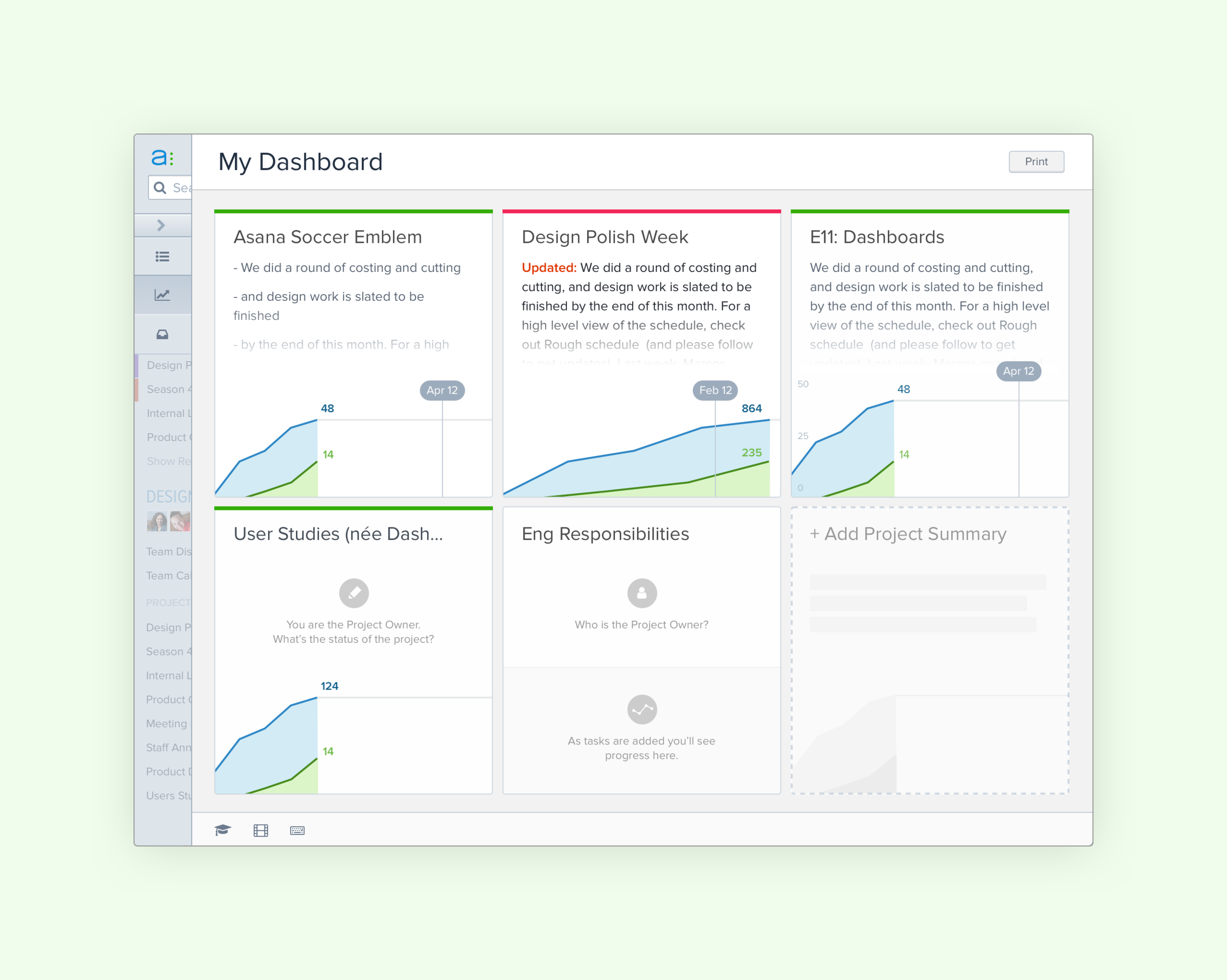
As a Senior Product Designer I worked with the PM to define what our users needed. We discovered through iteration and user research, that users wanted to see as many projects as possible on their screen, rather than more information about each project. We balanced this by surfacing a project summary: the project's Status Color, the first lines of the last Status Update, and at-a-glance data like Project Due Date and Project Owner.
Dashboards was launched as a premium feature, and quickly became one of the most successful launches and a top revenue driver for Asana.